Co-Intelligence, in Practice
Five rounds, twelve images and one share card: what building a brand with an agent actually looks like.
Co-intelligence is the idea that a person and a machine get further working together than either does alone. It's becoming more of everybody's day every day.
Here is small example, this site DrkPxl has had a look for a while: the purple-black, the coin gold, header art put through a 32 color VGA pass. What it did not have was a share card. Every link I posted unfurled into text in my font sitting in the middle of empty space.
Five rounds later we had a share card that I like but don't yet love, and the brand had rules on paper. Hermes runs on the Mac mini in my office. Grok renders the images. I brought the intent and the veto.
Designing
I asked for a computer in the first card, because the header art had a computer in it. Beige CRT, dim room, a gold spark over the keyboard.
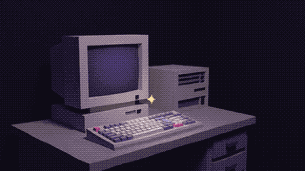
A good picture of a computer and a bad picture of a relationship. A share card is the one image that has to say what the site is about at thumbnail size, and retro PC is a style, not a subject. I killed it.
The next one dropped the hardware. Two profiles, human on the left, machine lattice on the right, gold pixels in the gap.
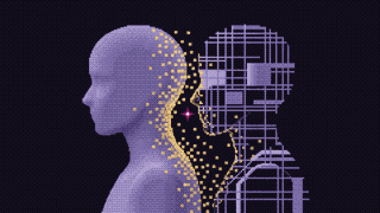
Hermes flagged the problem before it shipped: the human was dissolving into the lattice, which reads as replacement. That is the part of working this way I did not expect. Hermes argues about what the picture means.
The fix was one line of geometry. Two streams, mirrored, equal length, crossing at one spark. Grok copied the one-way flow from the reference on the first retry, so the reference came out and we wrote the geometry as text.
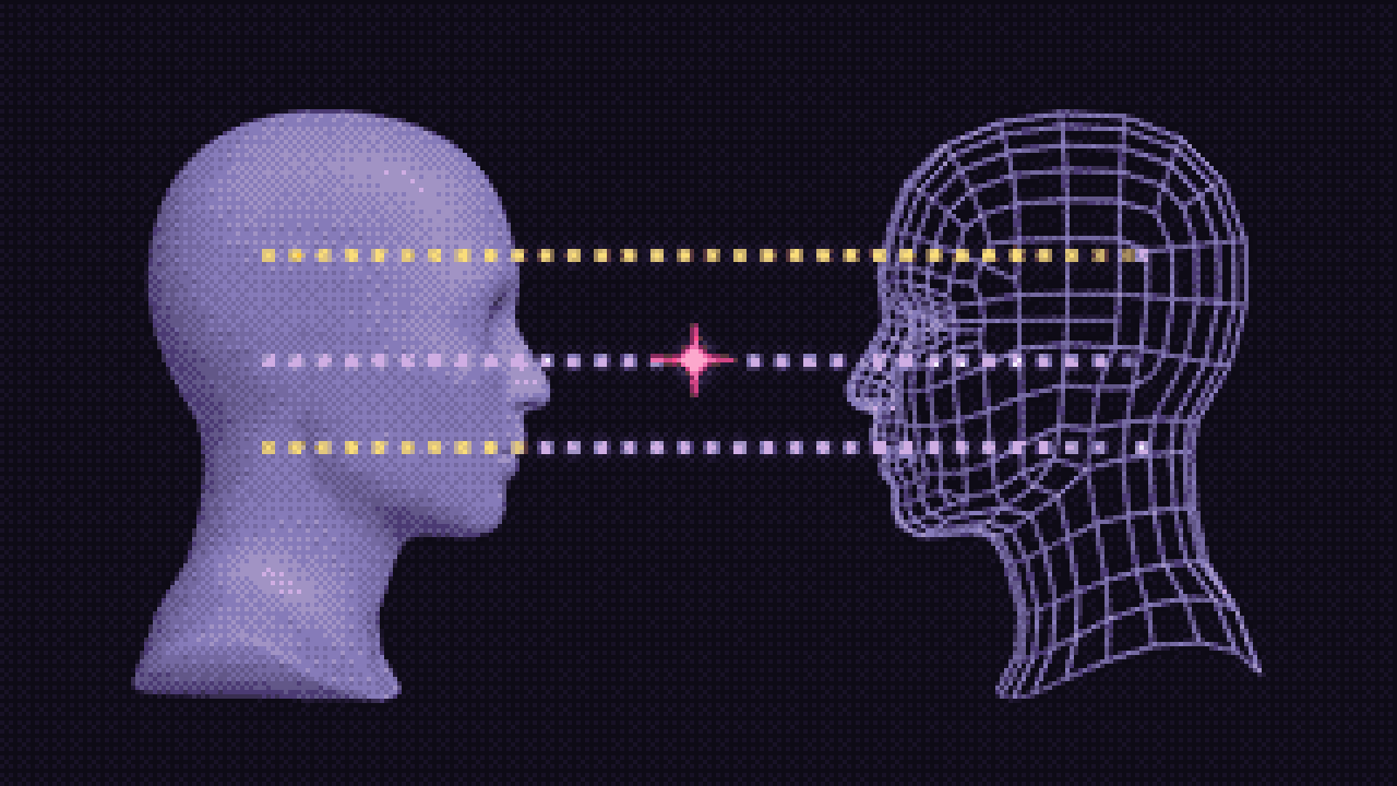
Both figures intact, same size, neither losing material. We shipped it as the site default.
Then I said the retro feel needed dialing back. The first answer was a duotone finish: same composition, smooth ramps, film grain, no dither.
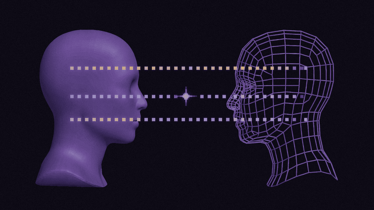
It solved the texture and lost the brand. Fine next to other people's link previews, no longer this blog. Dropped.
Round four: change the mechanism
We tried two more directions. Both died on the same thing.
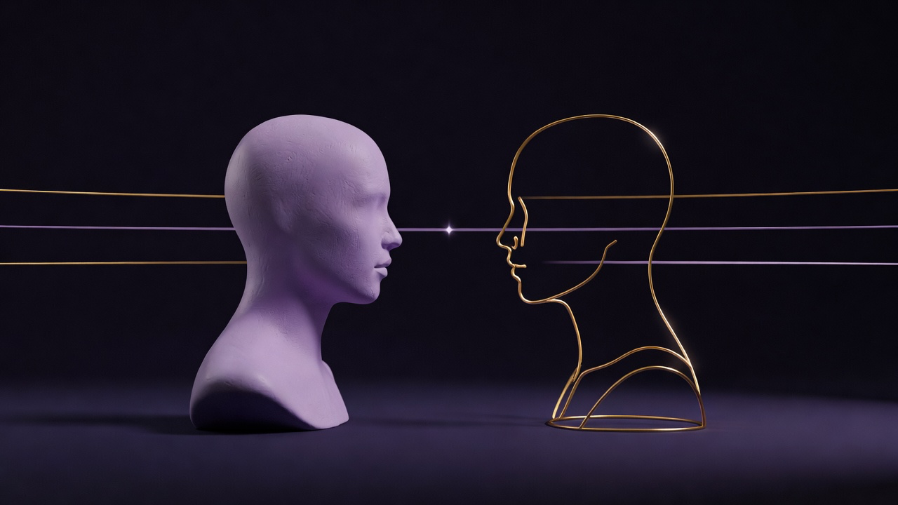
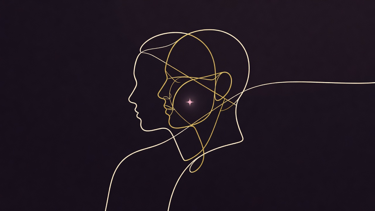
Clay turned the wireframe into glitter. The line drawing collapsed a head into arcs that belonged to no head. There is something here, but I don't know what it is.
Let's try a dot field encoding computed model with no line topology, so there is nothing to get wrong.
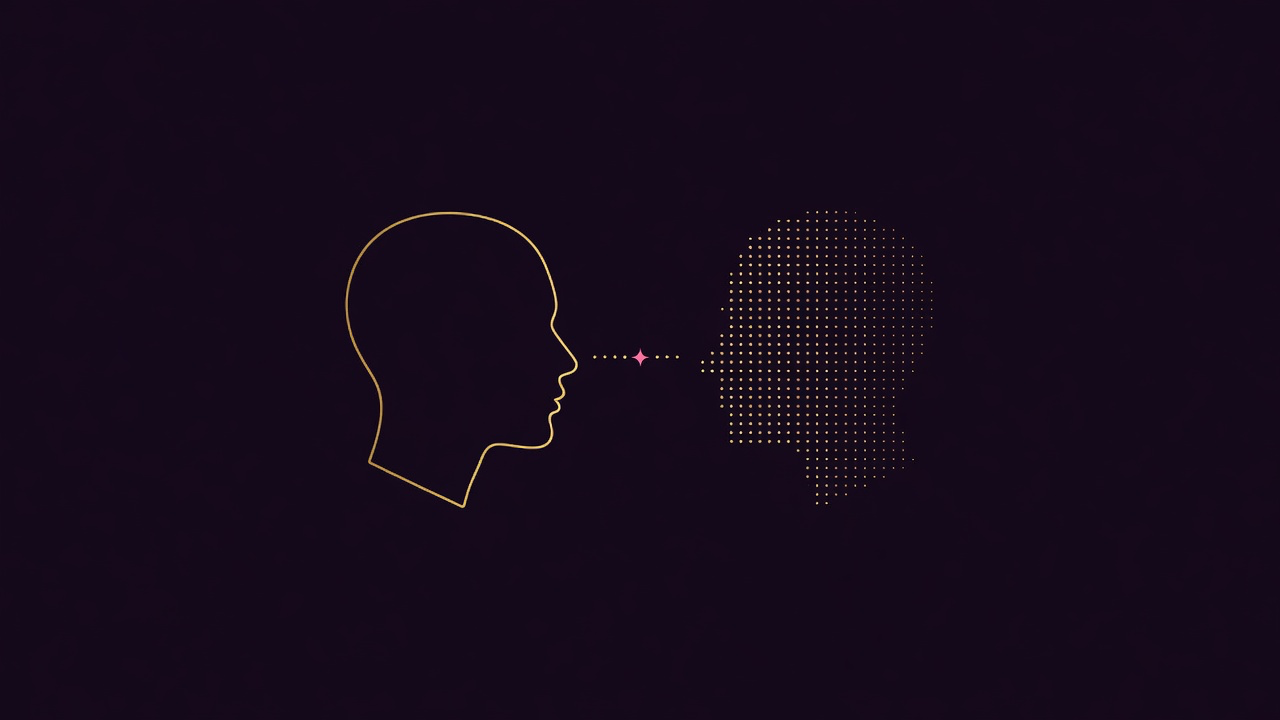
I took the two profile version over the nested one Hermes preferred. The dot field read as a copy of the human, which is why the next round gave the machine its own light. Rejections went both ways.
Round five: all the future light on one side
My direction: the human stays a flat gold line, the machine gets the retrowave. Pink and violet, glowing edges, a horizon grid behind that half only.
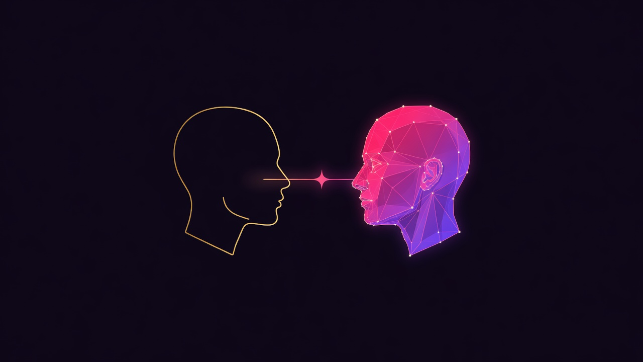
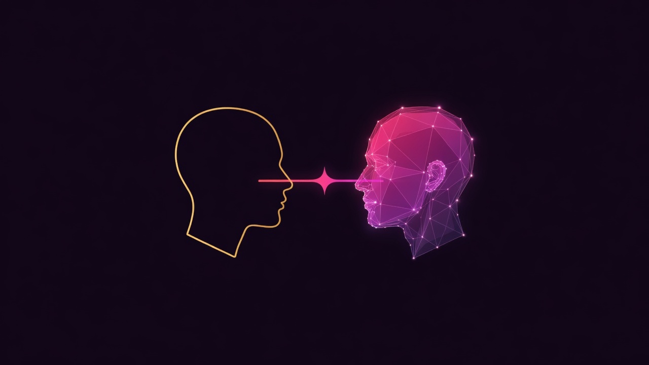
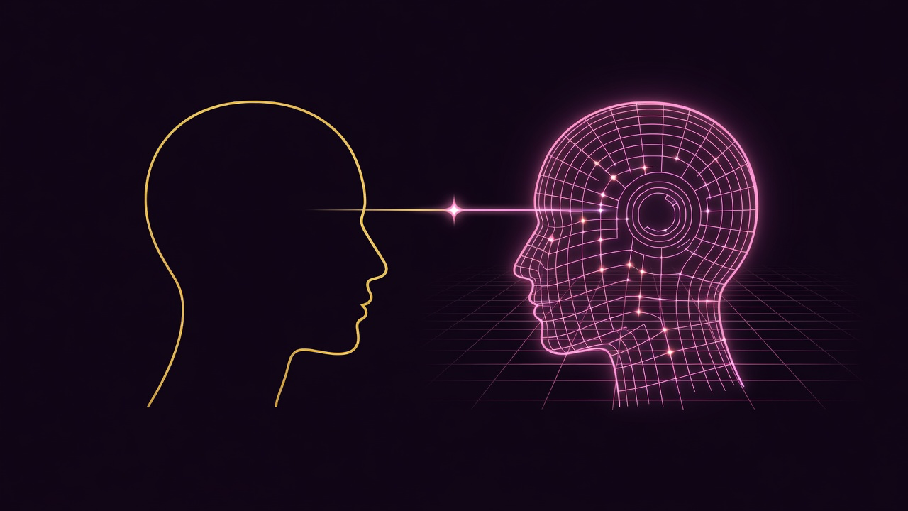
Hermes picked the faceted plexus, the balanced one. I took the horizon grid, which it had called the closest thing to a cliché on the board. I still think I was right. The grid makes the machine read as a different kind of thing instead of a different color of person, and it puts the 1980s on one side of the frame instead of over the whole card.
The final card (for today)
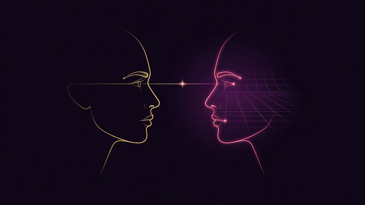
The image that ships is two intelligences facing each other. The human side is one flat gold line, no glow, no effects. The machine side is lit from inside. They are the same size, and neither one is losing material.
That is co-intelligence as I mean it, and it is also a description of how the card got made. I brought the intent, the taste and the veto. Hermes brought the renders, the measurements, and the willingness to say the picture was arguing the wrong thing. Neither of us gets there alone.